
Bizzdesign Unify: An AI-native platform for faster, better transformation decisions.
Bizzdesign Horizzon
Bring Clarity To Change
With Bizzdesign Horizzon
Accelerate Transformation With a Platform Designed for Scale
Get the adaptability, expertise, and clarity you need –– with trusted insights, transparent pricing, and full support across every architecture discipline.
Align. Design. Accelerate.
- Map strategies, customer journeys, and capabilities to see the full picture of change.
- Align processes, applications, data, and technologies with transformation roadmaps.
- Design connected future-state architectures that guide execution with confidence.
- Make dependencies and impacts visible across teams and stakeholders.
- Run scenario analyses to evaluate options and accelerate cross-functional decisions.
- Share self-service dashboards with executive audiences.
- Deliver transformation faster with open standards, embedded best practices, and proven methodologies.
Bizzdesign Horizzon’s Unique Capabilities
Design the future of change before you execute using Bizzdesign Horizzon's industry-leading capabilities.
AI-Powered Architecture Design
Design from strategy to implementation with intuitive modeling canvas.
Executive-Ready Presentations
C-suite relevant views and branded output for executive engagement.
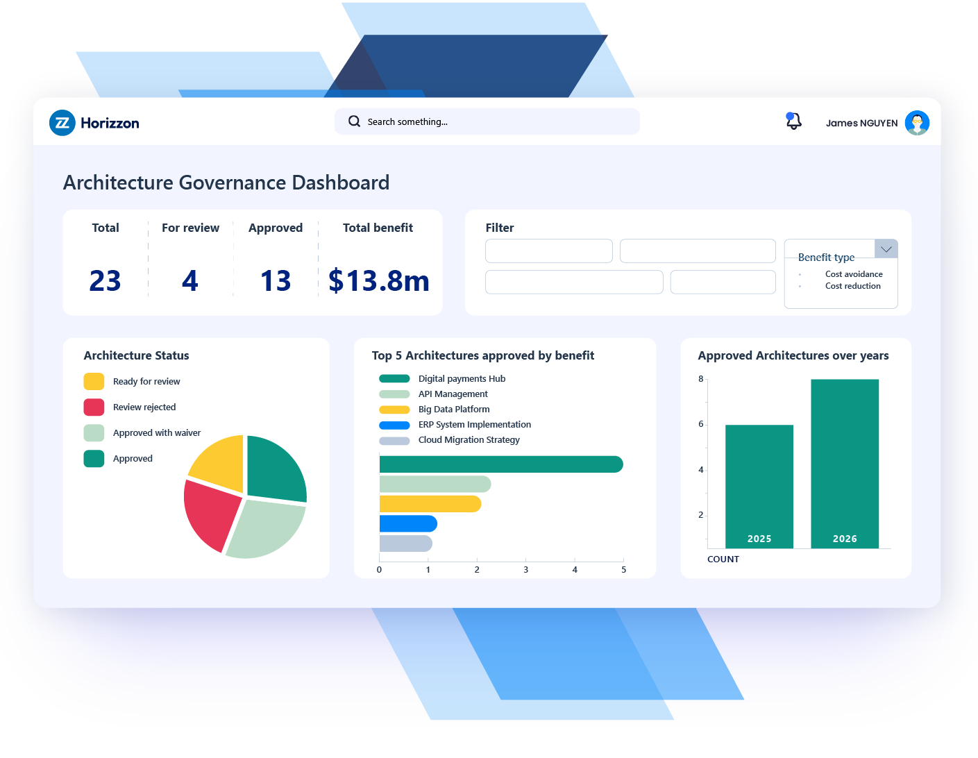
Enterprise Architecture Governance
Centralized and connected architecture data across all domains.
Enterprise-Wide Collaboration
Bring business and IT together with shared workspaces.
Tailored Dashboards and Analytics
Role-based dashboards and self-service analytics.
Open-Standards-Based Modeling
Model with ArchiMate, C4, BPMN, ERD, and UML.
A Leader in Gartner® Magic Quadrant™ for Enterprise Architecture Tools.
A Leader in Forrester Wave™ for Enterprise Architecture Management Suites.
Four Solutions. One Platform.
Other providers offer point solutions that quickly hit their limit as your practice matures. Bizzdesign Horizzon enables you to start small and scale as you grow.

Product-Related Resources


Looking To Cut Complexity and Accelerate Change?
Let's talk about your goals and how our experts can support you.