ArchiMate is the modeling language of choice for most enterprise architects. However, when ArchiMate is communicated to a business audience, the default visualization is often perceived as too technical. To solve this, Bizzdesign is creating alternative ways of visualizing ArchiMate models, such as the Metro Map. The new Metro Map view visualizes dataflow or processes more intuitively for a business audience, similar to a London Metro Map with ‘metro lines’ flowing between ‘stations’, representing applications or business functions.
ALSO READ: Make enterprise architecture diagrams more engaging for a business audience
Step 1: Select the ArchiMate model content you want to visualize
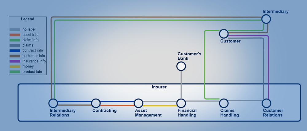
The image below shows the functional decomposition diagram from the ArchiSurance TOGAF example model. One of its purposes is to show how information flows between the various business functions. This is a great starting point for creating a dataflow Metro Map visualization. Simply select and copy the objects and relations you want to include in your map.

Step 2: Create a dataflow Metro Map
Create a new Metro Map view using the context menu in the model browser and paste the content selected in Step 1 onto the view. Next, use the on-canvas dropdown menu first to perform an automatic layout of the view and then to auto color the lines by name.

Step 3: Refine the visualization
You get a clearer visualization at the push of a button (see the figure below) by removing some superfluous ‘stations’, playing a bit with their position, using the relation layout and manually repositioning the labels. It’s also possible to manually change the color of the lines, the size of the stations and the formatting of their labels. Now you can have a meaningful discussion with business stakeholders about the information that flows through the organization.

The Metro Map visualization abstracts from details, such as the type of objects and the direction of the flow relations. Those details are usually not important for a meaningful discussion or can be presented in a voice-over. In addition, it’s possible to organize the diagram so that most flows point to the right or down, which most people perceive as the natural direction.

Methods to create a Metro Map in Enterprise Studio include:
A tip before you begin: Ensure that the flow relations are named, as their names determine the color. For more advanced use cases, it’s also possible to select another attribute to base the color on via the on-canvas dropdown menu.

Dataflow is just one example that could be visualized as a Metro Map to facilitate communication with the business. Our Metro Map view can also visualize processes (triggering relations), as illustrated below. What other applications can you think of?
GAIN EXPERT KNOWLEDGE: Visit our Enterprise Architecture wiki pages
We’re interested in hearing about the visualizations that you create to communicate with your business stakeholders. Please share your visualizations with us, or if you need more information on Bizzdesign’s Metro Map feature, contact us.