Learn more about solution architecture models, techniques, and languages to help you ensure flexible and efficient solution design.
Solution architects play a pivotal role in bridging the gap between complex business problems and technological solutions, and designing agile solution architecture models is central to their effectiveness.
Solution Architecture is a methodological practice that combines design and management skills to address specific business challenges through solution engineering. It involves tailoring IT solutions to specific business needs and defining their functional requirements and stages of implementation.
Solution architecture ensures that a new system fits into the existing enterprise environment, helps control costs and resources, impacts the overall project life cycle, creates standard documentation, and determines the best technical approach to solve problems.
To describe solution architectures, models are essential. Solution architecture models are more than just pictures: an architecture model consists of a coherent set of elements and relationships that describe the structure and behavior of the systems being designed. Unlike simple diagrams, models can be analyzed for various properties and can be visualized in appropriate ways for different stakeholders.
This ensures that everyone involved understands the solution, its properties, and how it relates to its context. Adopting an agile approach allows you to create scalable and responsive models that align closely with the organization’s strategic goals.
Different solution architecture models
Solution architecture models are blueprints for successfully implementing complex systems in various business environments. Each model, distinct in its structure and approach, addresses specific organizational or technical needs and challenges.
We describe some of the common models used by solution architects below:
Solution architecture application vs solution architecture system modeling
Solution architecture application and system models are related but distinct aspects of technical solution design. They both aim to create a clear and coherent representation of how a system or a process should work, but they differ in scope, level of detail, and purpose. Here are the key differences:
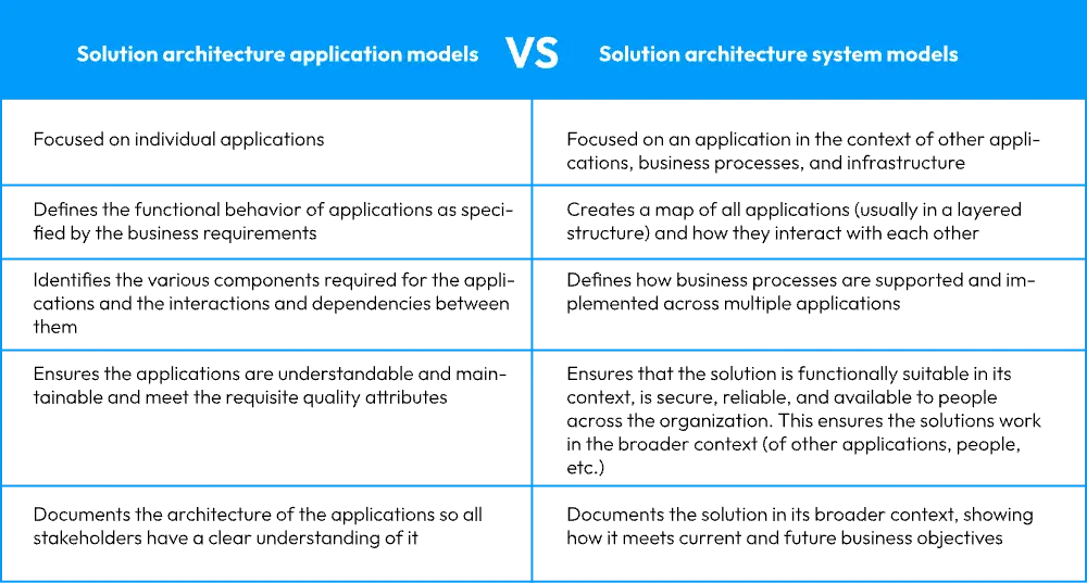
code structure. This layered perspective is instrumental in mapping out a system’s static elements and interactions, providing a comprehensive overview and actionable insights into the solution’s architecture.
Solution architecture system modeling explained
Solution architecture system modeling is an analytical process integral to understanding and managing the complexities of software and IT solutions. Unlike solution architecture application modeling, which zeroes in on individual applications, system modeling encompasses the entire ecosystem, capturing the dynamic interactions between various software applications and services.
It enables you to create visual diagrams that represent the structure of the entire system, illustrating how each application interfaces with others, which is vital for grasping the full scope of the system’s capabilities and potential bottlenecks.
The practical benefits of implementing solution architecture system modeling are manifold. It provides architects and development teams with a comprehensive system architecture blueprint. This blueprint is not merely a static picture; it’s an operational tool that details the system’s behavior, elucidates component interactions, and outlines the data flow across the system.
Such a meticulous approach ensures that every piece of the system aligns with the broader architectural strategy and meets the defined business objectives. Moreover, a well-executed system model acts as a navigational chart for development, facilitating informed decision-making and strategic planning, thus ensuring that the final solution is technical and strategically coherent.
Solution architecture data modeling
Data modeling helps architects and stakeholders understand how data is structured and utilized, making it an essential part of the overall solution architecture.
This process involves crafting a detailed depiction of how data is structured, stored, organized, and accessed within a specific architectural solution. It provides a comprehensive blueprint of an organization’s information systems, elucidating the intricate interconnections among data elements.
A data model serves as a guide for both logical and physical data structures. The logical data model represents how you interpret your data, often in terms of entities and their interrelationships. The physical model describes how the data will be stored, e.g., in database tables.
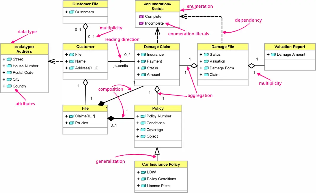
Class diagrams are used in solution architecture data modeling. Class diagrams are fundamental to the object modeling process. They are used to visualize the structure and behavior of software systems, including the relationships between classes and their organization within the system.
In the context of data solution architecture modeling, class diagrams can represent the static structure of the system’s data, including the classes, attributes, methods, and interactions. They provide a high-level view of a system’s data structure and components, supporting understanding the relationships between different data entities and their organization within the solution architecture.
Solution architecture process modeling
Solution architecture process modeling involves creating a visual representation of the processes involved in a system and how they interact with each other. This approach helps you understand your system’s functions and spot potential issues or enhancements early in development. It’s crucial to note that this collaborative endeavor requires continuous communication and coordination among you, stakeholders, and development teams.
You can employ several techniques for solution architecture process modeling. Process flow diagrams illustrate activities and processes within your system, commonly used for business process modeling. Activity diagrams provide more detailed insights into the activities involved in a process, while state diagrams depict your system’s different states and the transitions between them.
Remember to adhere to best practices to ensure the success of your solution architecture process modeling. Involve stakeholders early in the process, employ standardized notations and diagrams, and regularly review and update your models.
Utilizing Business Process Modeling Notation (BPMN) can be particularly beneficial for generating graphical representations of business sequences, especially when implementing business automation processes or products featuring business workflows like approval cycles.
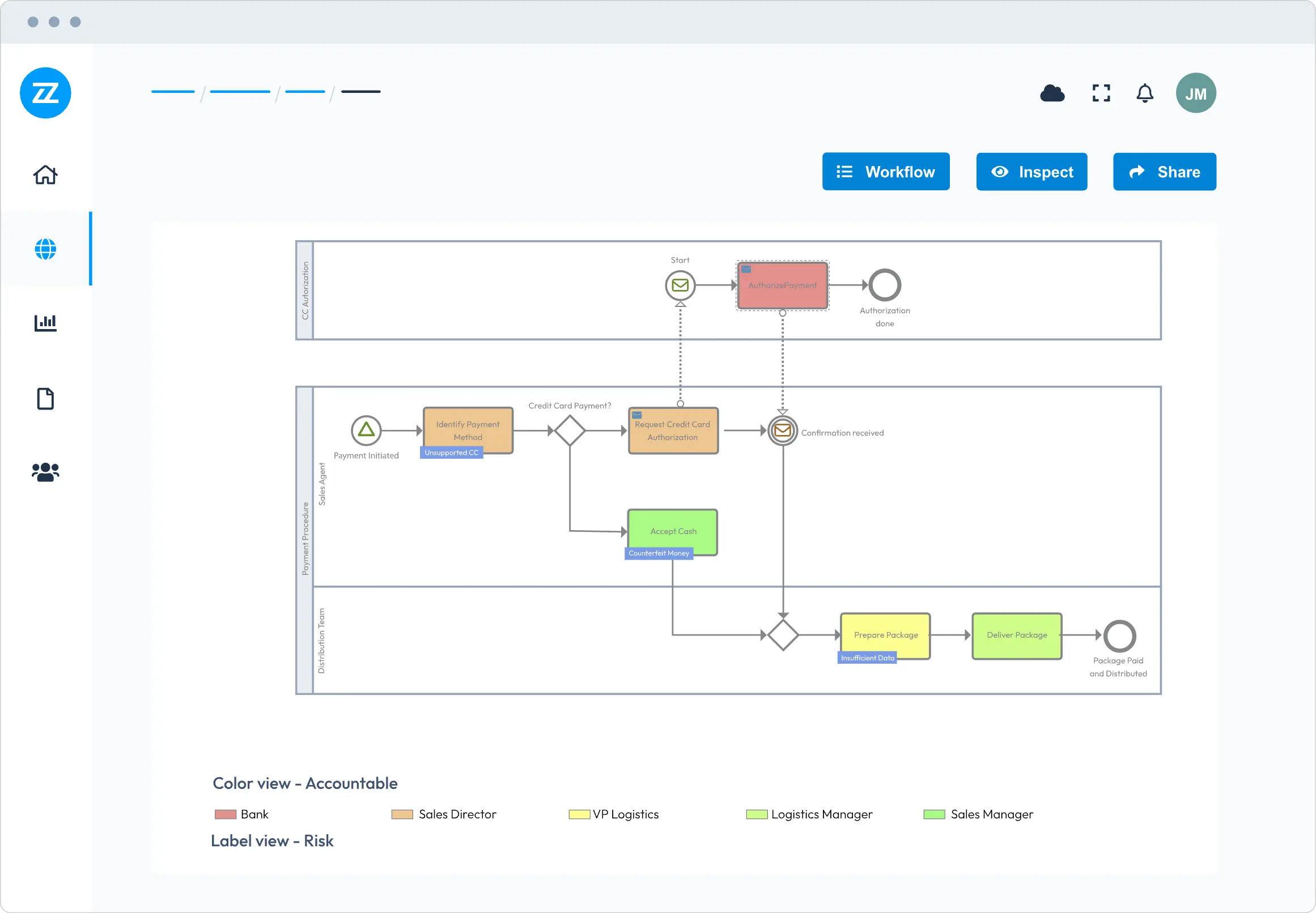
Source: Bizzdesign Horizzon An example of a solution architecture process model
Solution architecture infrastructure modeling
Solution architecture infrastructure modeling is crucial to designing and documenting complex software and IT solutions. It involves creating a map of the hardware and software infrastructure needed to support the solution’s development, testing, deployment, and operations.
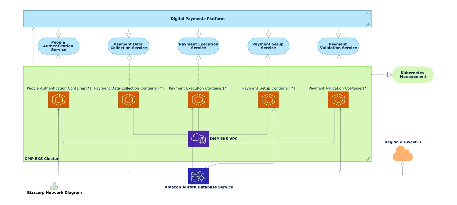
Source: Bizzdesign Horizzon– An example of a solution architecture infrastructure model
A solution architecture infrastructure model represents your IT infrastructure comprehensively. This includes systems, processes, databases, and software applications while considering their intricate interrelationships. The objective is to understand the existing architecture, enabling you to pinpoint gaps, redundancies, and inefficiencies. This, in turn, empowers you to design more efficient and resilient systems.
A pivotal facet of infrastructure modeling involves establishing a central repository of information, extending beyond the storage of isolated diagrams. This repository promotes data reusability, offering a concise view of your environment and the intricate relationships and dependencies among various components. Moreover, it equips you to identify potential trouble spots and risks, which is especially valuable during complex changes. It is also very useful in supporting operational resilience since you can analyze dependencies and identify, e.g., single points of failure in the infrastructure.
Infrastructure modeling isn’t a one-time effort; it’s a continuous process that accounts for system updates, the adoption of new technologies, and evolving business needs. This is also true for most modeling since what you model will be subject to change.
3. Explaining different solution architecture modeling techniques
A solution architecture framework provides a structured approach to design, document, and communicate solutions for complex problems. It guides you to ensure that the software solution aligns with the organization’s business needs and objectives.
Solution architecture modeling techniques are used for designing and documenting complex software and IT solutions. These techniques help solution architects and stakeholders better visualize and analyze a system’s structure, components, and behavior.
When selecting a solution architecture modeling technique, you must weigh various factors. These include project specifics like size, complexity, and requirements alongside functional and non-functional Architectural Drivers. Security, performance, client expectations, vendor considerations, hosting, OS, and developer expertise are also crucial. Familiarity with industry standards and best practices is also vital. Utilizing established industry patterns and standards in conceptual models is essential.
Examples of different software architecture modeling techniques include:
C4 modeling
The C4 model is a lean graphical notation technique that assists in the visualization and documentation of software architecture. It’s particularly useful for solution architects when they need to communicate complex design choices effectively.
The model’s strength lies in its abstraction-first approach, which organizes the architecture into four hierarchical levels: Context, Containers, Components, and Code. Each level provides a different granularity, making it ideal for stakeholders with varying needs.
The Context diagrams show the system’s relationships with users and other systems, providing a high-level overview. Container diagrams zoom in on a level to display the major system parts (applications, data stores, etc.). Components diagrams break down containers further into their major components. Lastly, the Code level gives a detailed view of the system’s construction.
The C4 model encourages iterative and incremental architecture, facilitating both upfront design and retrospective documentation, making it a versatile tool for architects in various stages of development
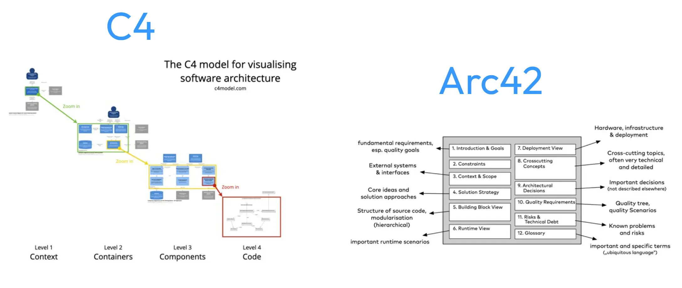
Enterprise architecture tool, Bizzdesign Horizzon, includes reference architectures for different industries based on C4 and Arc42
arc42
arc42 is a template for architecture communication and documentation based on practical experience of many systems in various domains, from information and web systems to real-time and embedded systems, business intelligence, and data warehouses. It provides a systematic but flexible approach for large and small teams in iterative or less agile processes. The template is open-source and can be used free of charge [5].
Unified modeling language (UML) diagrams:UML provides various diagrams and notations for modeling software systems. Class, sequence, component, and deployment diagrams are commonly used in solution architecture modeling. Use case diagrams to define the interactions between actors (users or external systems) and a system. They are useful for capturing and communicating system requirements and functionality.
Entity-Relationship Diagrams (ERD):ERDs model the data schema and relationships between entities in a database. They help architects design and document data structures.
Process flow diagrams:These diagrams show the flow of activities and processes within a system. They are often used in business process modeling.
4. Various solution architecture modeling languages
Solution architecture modeling languages provide a standardized way to communicate and document the solution architecture. These modeling languages have standardized notations and symbols, ensuring consistency and clarity in architectural diagrams.
Visualization is a key feature of these languages. They enable the creation of visual representations of architecture. These languages also support different levels of abstraction, from high-level conceptual views to detailed implementation views. This allows architects to represent architecture at the appropriate level of detail.
Formal semantics provide precise definitions of the meaning of constructs within the language. This ensures that the models are unambiguous and accurately represent the intended architecture. Some modeling languages can be extended or customized to suit specific modeling needs or domain-specific requirements.
- UML:
The Unified Modeling Language (UML) is a modeling language that helps specify, visualize, and document models of software systems, including their structure and design. It is a standard notation for modeling real-world objects as a first step in designing an object-oriented system. UML provides a methodology for creating diagrams that communicate the various aspects of a system’s design, allowing project teams to share and discuss concepts, collaborate on the modeling process, and design the final software [6]For effective solution architecture modeling, your tool should inherently support the UML 2.5 specification and offer a repository of model templates to provide the foundational elements necessary for UML modeling. - SysML:
SysML (System Modeling Language) is a modeling language used to model complex systems. It’s an extension of the Unified Modeling Language (UML), commonly used for software development. SysML has been developed to enable engineers to model complex systems systematically, capturing a system’s functional and physical aspects. - ArchiMate:
ArchiMate is an open and independent modeling language for enterprise architecture that provides a uniform representation for diagrams that describe enterprise architectures. It is a visual language with a set of default iconography for describing, analyzing, and communicating many concerns of enterprise architectures as they change over time.
ArchiMate provides a set of entities and relationships with their corresponding iconography for the representation of architecture descriptions. The language includes concepts for specifying interrelated architectures, specific viewpoints for selected stakeholders, and language customization mechanisms. It offers an integrated architectural approach that describes and visualizes different architecture domains and their underlying relations and dependencies.
Which solution architecture modeling tools should you use?
When it comes to solution architecture modeling, employing a dedicated enterprise architecture tool is significantly more effective than basic architecture diagramming tools.
The familiar architecture diagramming tools you use may be commendable for specific tasks. However, they often fall short in helping you design technical solutions that align with your organization’s business goals.
Similarly, while the conventional architecture diagramming tools are great for basic visualizations and have served well in more straightforward scenarios, they often struggle to capture the granularity, interdependencies, and comprehensive view required for holistic enterprise architecture.
For a nuanced, in-depth, and efficient design process, you need a tool, such as an enterprise architecture tool, that caters to the complexities of today’s digital enterprise environment.
Integrating solution architecture with enterprise architecture brings several benefits. It ensures that the solutions are technically sound and strategically aligned with the business goals and processes. This integration facilitates better governance, risk management, and a more efficient allocation of IT resources. By maintaining this alignment, organizations can ensure that their IT investments drive their business objectives forward rather than creating isolated systems that may not contribute to the overall strategy.
In short, here’s why a dedicated enterprise architecture tool outperforms general diagramming tools for solution architecture modeling:
- Enterprise architecture tools are tailored for various modeling activities, including application, infrastructure, and data modeling. They allow architects to apply different methodologies appropriate for each project’s requirements, ensuring a tailored approach to solution development.
- Enterprise architecture tools come equipped with extensive modeling notations and templates. This rich variety is essential to capture the nuanced details of various architectural domains, enabling architects to model complex systems and relationships accurately.
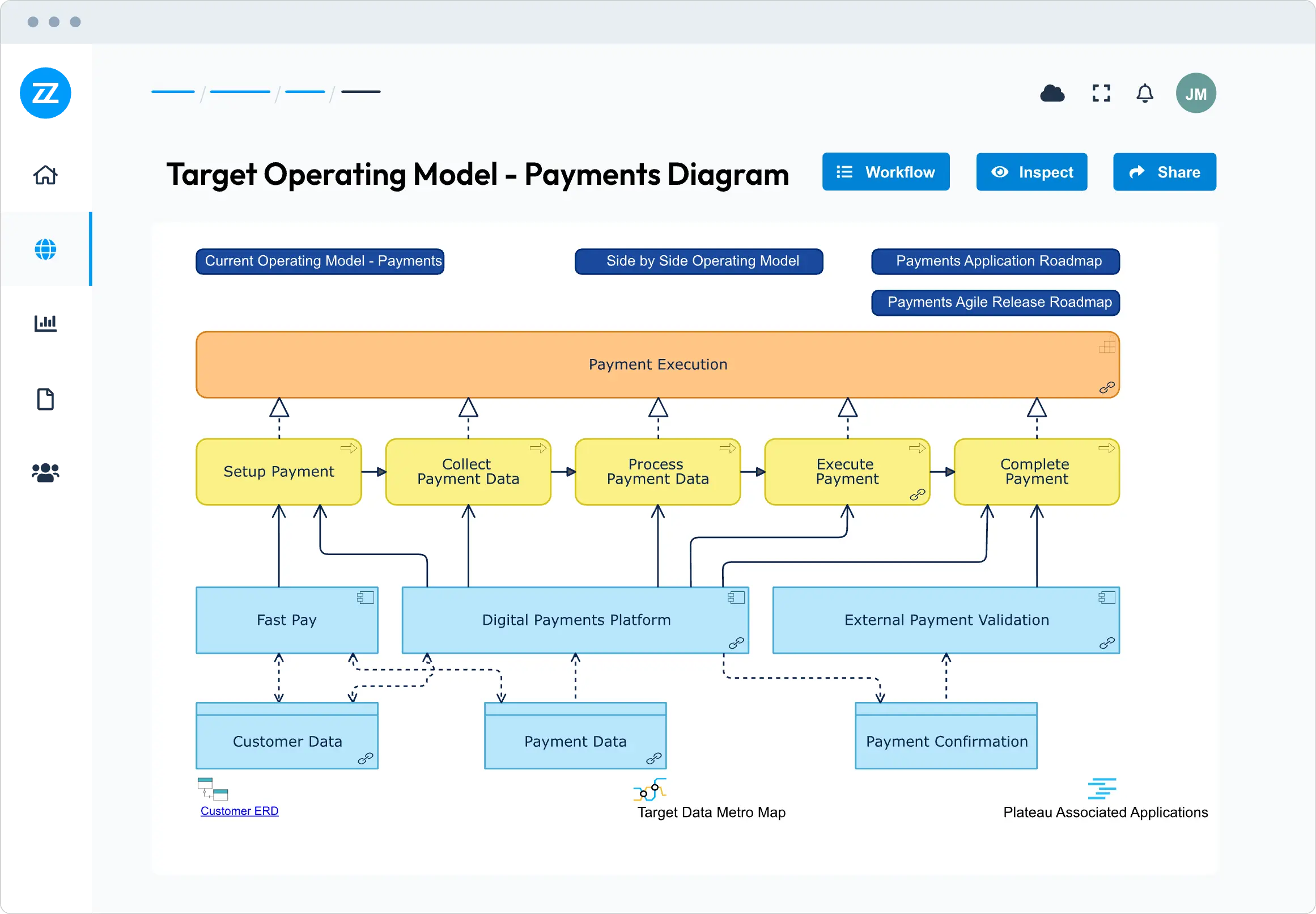
Source: Bizzdesign Horizzon– Enterprise architecture tool Bizzdesign Horizzon allows solution architects to analyze the impact of solutions by creating dependency views.
- The structured approach provided by enterprise architecture tools helps achieve consistency and predictability in design outcomes, which is often a challenge with general diagramming tools lacking specialized features and guidance.
- Dedicated tools are often developed in alignment with industry best practices and standards, such as TOGAF or ArchiMate, which can enhance the credibility and interoperability of the architectural models produced.
- Purpose-built tools for solution architects offer advanced features that streamline the design process, leading to higher-quality results in less time. They support architects in delivering comprehensive design work that can accommodate necessary changes with minimal disruption.

